Whether you’re a professional interior designer or you’re just looking to add a little more organization to the look of your room, knowing how to use color schemes without creating a clash disaster, is a skill that anyone working with decor should have. Color trends will change, but knowing how to navigate palettes of color is a skill that will never go out of style
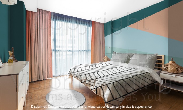
The first and easiest way to gracefully add in a collection of colors is by utilizing the concept of color blocking. The straight lines found between the colors seem to cut right through them and add strong contrast, giving the room a bold look. When you color block your walls, you will have already set the tone for your main colors in the room so you don’t have to go through the process again when it comes to picking out accent pieces. You can use any color, but it’s best to stay simple and stick with only 2-4, using multiple shades of one color for 2 of those. For an idea of where to start, Hunker offers a whole post of examples and inspirations for color blocking here.
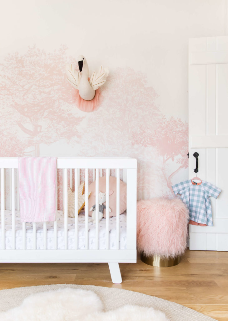
In this beautiful nursery by stylist Emily Henderson, there is definitely more than one color, but the overpowering color is obviously pink. An easy way to get a palette started is by selecting one dominant color that will overpower the others. Just like the blue plaid outfit on the door handle catches the eye, your accent colors will stand out even more when placed in a room that is decorated mostly with a primary designated color. Home Decor Group New shows how to use the dominant color white or grey in a variety of different style settings here.
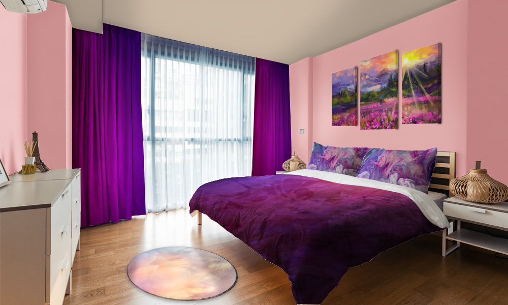
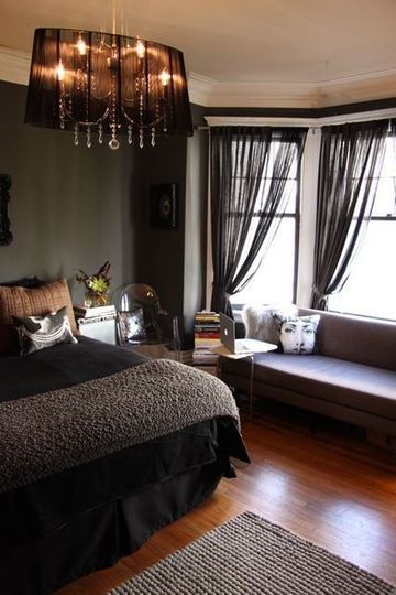
Contrast can also be a helpful tool in implementing a color palette into your room because all you have to focus on is how dark or light a color is rather than spending time and energy trying to form the perfect combination of actual colors. In this luxurious bedroom, there are hints of purples, grays, reds, and greens and they all flow together because of how dark the shade of each color is. Had each of these colors been lightened, it may not have the same effect. However, if you prefer brighter room, you can have access to a full guide to decorating with soft colors like a shabby chic style – Shabbyfufu shows it well here.
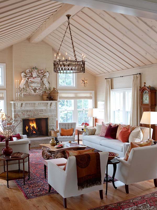
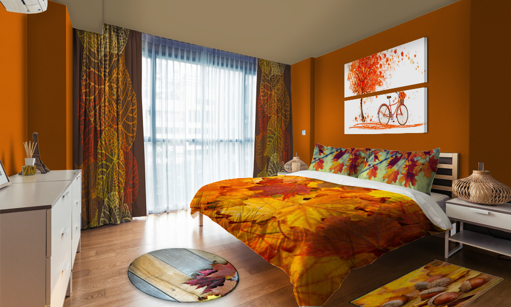
Perhaps one of the most user-friendly ways to use color schemes is to just focus on the seasonal aspect of a room. While summer is a bit harder to define, fall decor almost always consists of colors like orange, dark reds and creamy ivory like the shades seen in this gorgeous living room. If you find yourself settled on a color scheme that you don’t want to change as the holidays come and go, you can stay festive with Making Home Base’s tips on how to decorate seasonally without changing your colors.
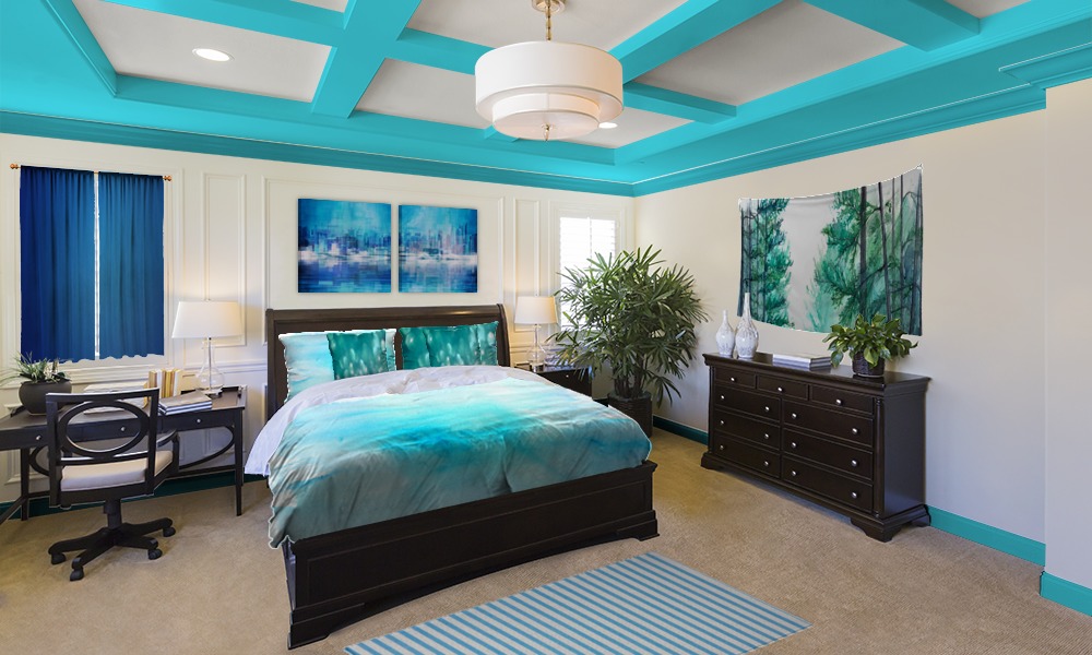
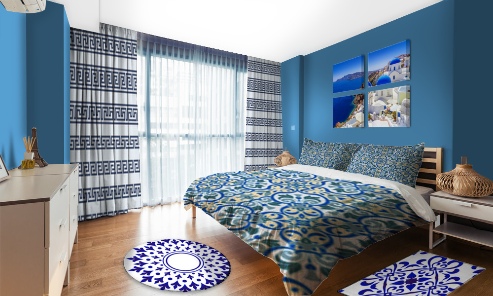
The last trick to working with color schemes is to use multiple colors while focusing on their temperature. Colors can be warm like pinks and light oranges or they can be cool like blue and purple. Neutral colors like gray can be made to be warm or cool with a tint of a color from either side. Provident Home Design goes even more in depth on color temperature and offers inspiration here.
